Was heute Emails sind, waren im 18. Jahrhundert Briefe. Wir zeigen, wie sich die digitalisierten Briefe von und an Johann Caspar Lavater in einem GIS visualisieren lassen.
Schlagwort-Archive:Geografische Visualisierung
Create Convincing Maps for your Research and Teaching
Creating maps and visualizing spatial data can be done quite easily today. The workshop shows how to create different kinds of maps that can be used as illustrations for your“Create Convincing Maps for your Research and Teaching” weiterlesen
“Es gibt Wrack-Hotspots an Orten, wo ich sie nicht erwartet hätte”
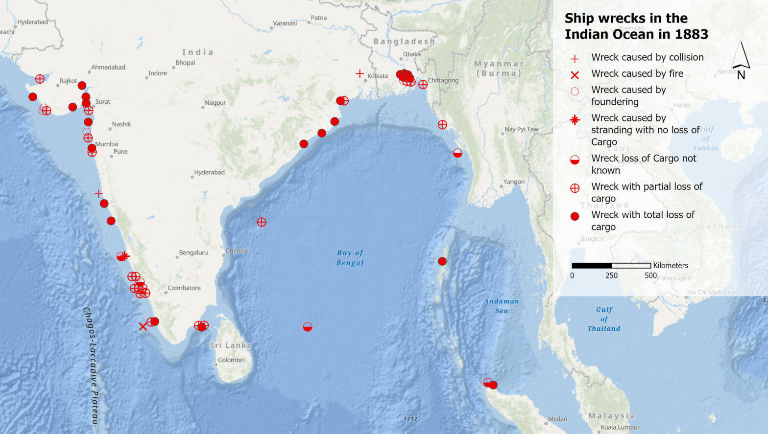
Was können uns Schiffswracks im 19. Jahrhundert im Indischen Ozean über das Klima der Vergangenheit sagen? Und was verraten uns die Aufzeichnungen dieser Wracks darüber, wie Klimawissen generiert wird? Diesen Fragen geht Debjani Bhattacharyya, Professorin für die Geschichte des Anthropozäns am Historischen Seminar der UZH, in ihrer Forschung nach.
Was sagen Volksmusik-Sendungen über uns aus?
Volksmusik-Sendungen sind mehr als nur Unterhaltung. Was sie über die Gesellschaft, Kultur und Heimat aussagen, dem geht ein SNF-Forschungsprojekt nach. Wir vom GIS Hub durften fürs Projekt eine Karte der Sendeorte erstellen.
Comparing two sets of point data (III)
When we count points of two data sets per cell, we can compare their densities. Generating Chi expectation surfaces allows us to compare actual with expected densities. To come back to our geographical names with “wald” in Switzerland, we could compare if these names are over- or underrepresented compared to all the geographical names.
Working with point data (II)
This is part II of the point data tutorial for QGIS. It teaches you how to create a grid to calculate a density surface, that is to count the points per grid cell.
Selecting point data in QGIS (I)
Let’s assume: You have imported point data into QGIS and want to analyse it further. This short tutorial shows you step by step how you can filter your dataset based on an attribute or on the spatial location.
How to start a new project in QGIS?
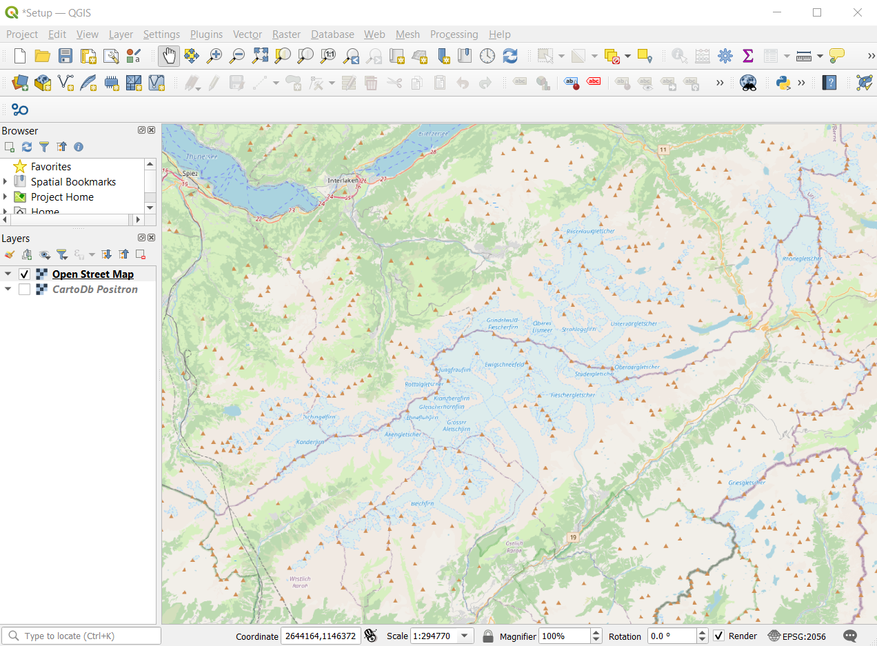
You have spatial data and know what you want to analyse, but how do you start? This short tutorial gets you started and guides you step by step through a project setup.
Using GIS to tackle the SDGs
How do companies, NGOs and public institutions monitor their progress towards the sustainable development goals (SDGs), and how can GIS software contribute? Five speakers provided answers from different perspectives at the event “Using GIS to tackle the SDGs”, organized by the GIS Hub and ESRI Switzerland.
“I love to see my data on a map”
As a dialectologist, Carlota de Benito Moreno is interested in how linguistic features change over time and space. By plotting her data on a map and combining it with historical data, she can detect diffusion patterns, divides, or clusters. Sometimes, she even discovers something she did not expect.


